
Holland & Barrett
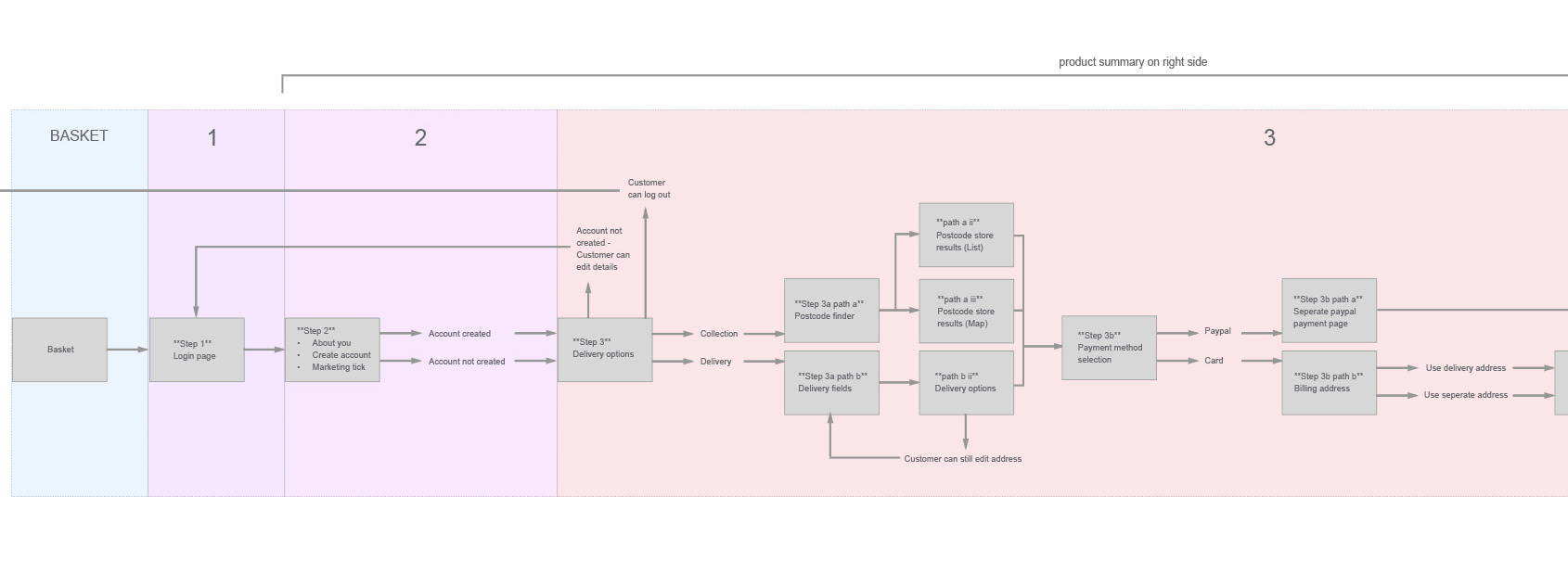
The evaluation of the site resulted in data that highlighted the pain points and main dropoff areas. Tasks were split into smaller sized UI changes and larger scale projects.
Requirements gathering
• Existing Market segmentation which covered in-store and online.
• Specific analytics and the identified ‘drop-offs’ in respective user journeys.
• User feedback and recordings to determine behavioural findings.
• Brand guidelines from documentations and interviews with brand and marketing heads.
Research
• Redefined user flows based on comparison research.
• Competitor analysis with improved focus for each website requirement.
• Content hierarchy analysis based on feature definition.

Design strategy
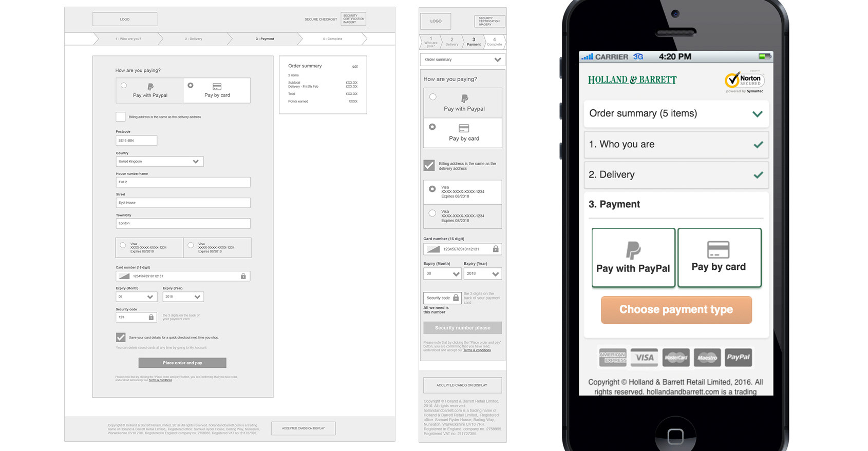
• Initial high detailed wireframing from concepts using Sketch.
• Low fidelity prototypes using Marvel, showcased as videos.
• High fidelity prototypes using Axure RP for user testing.
Implementation
• Frequent communication with feature team on functionalities.
• Responses to JIRA tickets, with CSS attributes where necessary.